Graphical abstracts: a guide to visual summaries that work
In today’s fast-paced research environment, scientists struggle to make their work stand out in an ocean of publications. With scientific abstracts becoming increasingly dense with jargon, researchers need new ways to communicate their findings effectively. Graphical abstracts offer a visual solution, changing how we share and consume scientific knowledge. For PhD students, R&D directors, and researchers alike, mastering this format is essential. This guide will walk you through everything you need to know about creating compelling graphical abstracts that capture attention.
What is a graphical abstract?
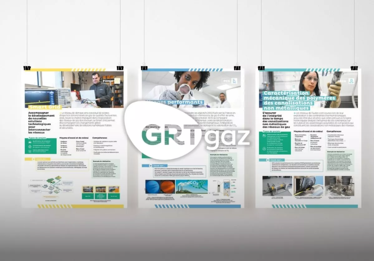
As its name suggests, a graphical abstract is a single, self-contained visual that summarises the key elements of a research article or project. Think of it as a standalone illustration that captures your study’s objectives, methodology, and main findings immediately, without requiring readers to dive into the full text. Unlike traditional figures pulled from your manuscript, a graphical abstract should be designed to deliver a key message. You thus need to create a new illustration in its own right and select the information you want to share.
The purpose of this visual representation is communication: whether to catch the attention on a journal website, to share your research on social media, or to facilitate quick literature reviews.
Key characteristics include:
- Visual-first approach: combines images, icons, and minimal text.
- Self-contained: tells a complete story without additional context.
- Audience-aware: can target fellow researchers, practitioners, policymakers, or the general public.
- Multi-purpose: works across journals, social media, presentations, and funding applications.
Many scientific journals are now offering it as an optional or mandatory component. This reflects a broader shift toward making research more accessible and digestible in our visually driven digital landscape.

Why invest time in creating one?
This type of visual summary may attract more readers to your study, as some studies suggest.
For example, a 2023 study published in Translational Behavioral Medicine, indicates that graphical abstracts increase traffic to scientific text abstracts and help authors achieve higher Altmetric attention scores — a key indicator of online visibility and engagement across social media platforms.
Beyond academia, graphical abstracts offer practical value for R&D teams and innovation projects. They facilitate internal knowledge sharing across departments, effective communication with non-technical stakeholders, and visibility for patent applications and funding proposals.
The bottom line? Graphical abstracts are a great way of expanding your research’s reach and accessibility.
3 rules to design effective graphical abstracts
Creating a successful graphical abstract requires more than aesthetic sensibility; it demands strategic thinking about information hierarchy and audience needs. Here are the core principles backed by research.
Select your message and keep only the necessary information
According to Antoine de Saint-Exupéry: “Perfection is achieved, not when there is nothing more to add, but when there is nothing left to take away”. This is especially true for graphical abstracts! It is of utmost importance to avoid overloading your illustration with text or images. As such, the first step consists in selecting the information that will appear in your graphical abstract. Ask yourself the following question: “What takeaway message should my readers remember?” Indeed, the target audience needs to quickly get an overview of the objectives and key results of your research work. Resist the temptation to include everything: overloading defeats the purpose.
While we process images faster, our understanding improves when text reinforces visual information. Do not hesitate to highlight key figures or keywords from your study. But make sure you find the right balance between written information and visual elements to create an attractive and self-standing graphical abstract.
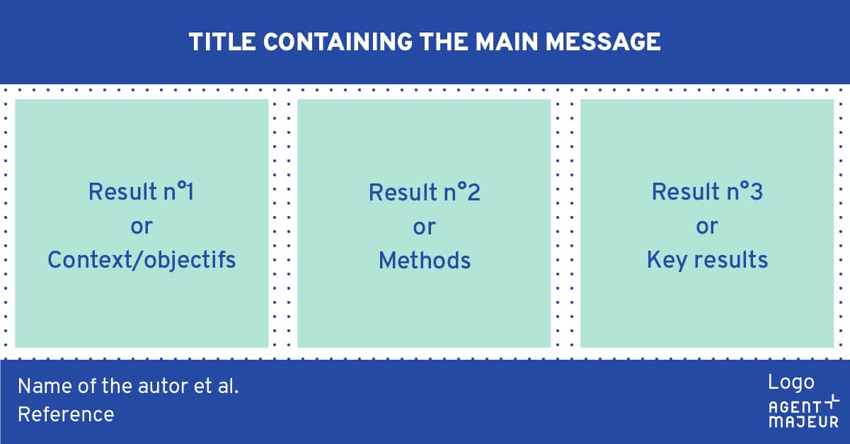
A graphical abstract usually includes a clear title, the study’s objectives, a summary of the key results, the authors’ names, and the institution’s logo. Remember to include the complete reference of the scientific article in your graphical abstract once it is published: title, journal, date, Digital Object Identifier (DOI). It is not necessarily interesting (or even possible) to include a Methods section, unless it is relevant in the context of your work.
Pay attention to design
Mastering the rules of graphic design and composition is vital to creating successful illustrations. Unfortunately, visual hierarchy and contrast are often underused in scientific illustrations. Here are basic principles to follow.
After defining your message, you need to structure the information included in the illustration. Ask yourself the following questions: “What are the most important elements? In which order must readers receive the information?” You will then be able to emphasise the key elements, those that need to stand out or to be seen first. There are no specific rules for layout, but your graphical abstract must comply with reading directions: from top to bottom and left to right. White space (or negative space) will also be vital to space out the content of your graphical abstract. Do not underestimate these empty areas, which increase readability and help your readers to grasp the content.
Pay attention to the size and colour of elements. You may increase or decrease the size of text or images, but beware of the final size of each element; they must remain legible even when reduced. You should use contrasting colours, readable fonts, and of course, include shapes or symbols (arrows, numbers, icons) to guide your readers’ eyes. Avoid relying solely on colour to convey information, as people with colour-blindness may miss the main message of your illustration.
Keep in mind your target audience
Before you start creating your illustration, ask yourself: who are you trying to reach? A graphical abstract intended for fellow specialists can include more technical terminology and detailed methodology, while one aimed at policymakers or industry partners should focus on practical implications and real-world applications. For interdisciplinary audiences—common in innovation ecosystems—strike a balance by explaining key concepts without oversimplifying.
Research communications officers and R&D managers should consider creating multiple versions of the same graphical abstract, each tailored to specific stakeholder groups. This targeted approach ensures your message resonates with each audience, whether they are reading your work in a scientific journal, on LinkedIn, or reviewing it in a funding proposal. The most effective graphical abstracts are not just visually appealing—they speak directly to their intended readers’ needs and interests.
Want to master crafting a graphical abstract?
Check our program “Create a graphical abstract”
From a research paper to a visual story: a step-by-step approach
Creating your graphical abstract for a research paper does not need to be daunting. We suggest you follow these practical steps.
1. Define your core message: before opening any design software, answer this question: “If my audience remembers only one thing, what should it be?” This becomes your north star throughout the design process.
2. Check format requirements: when submitting to a scientific journal, do not forget to read the journal guidelines (e.g. content, figure types, format, size, symbols). See, for example, Elsevier graphical abstract guidelines. Furthermore, if you want to publish it easily on social networks, choose a compatible format (for example, 1200 X 627 pixels for LinkedIn).
3. List all essential elements: title, images, diagrams, icons, concise texts, key data, …
4. Sketch before you design: try different information flows and organisation without getting lost in design details.
5. Use design tools such as Canva, Microsoft PowerPoint, or BioRender (icons and templates related to life sciences research) to help you craft an attractive illustration.
6. Get feedback early: before finalising, share drafts with colleagues—ideally including your target audience. A fresh perspective often catches unclear elements you have overlooked.
Creating your first graphical abstract may require an investment, but the payoff extends beyond a single publication. The skills you develop creating graphical abstracts—distilling complex information, visual thinking, audience awareness—transfer broadly to other communication contexts. Moreover, this type of visual representation is not just for journal submission. We thus encourage you to use it in different contexts:
• in conference presentations, to deliver a take-home message
• on research group websites
• in funding applications
• for internal progress reports
• as social media content across multiple platforms
If your graphical abstract helps one additional reader understand and value your work, it has succeeded. In an era where attention is scarce and information abundant, that is an advantage worth pursuing.
Get premium training with us
Check our program “Create a graphical abstract”
On a similar theme